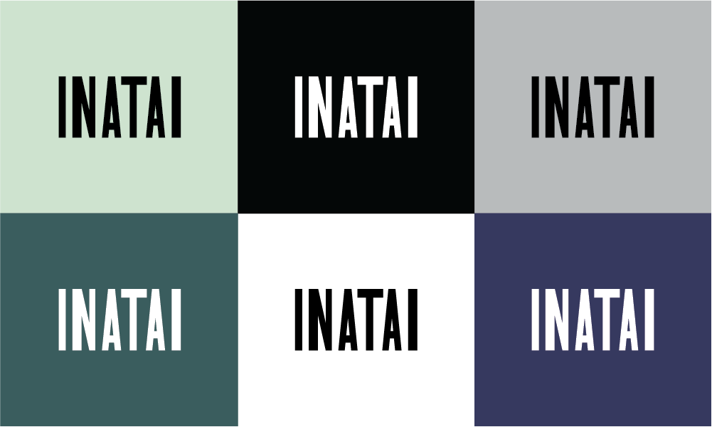
Inatai Foundation’s new typeface logo
Over the last year and a half, Inatai Foundation has been on a journey: to honor our roots and to better reflect who we are now and who we aspire to be in service to the powerful organizations and leaders we support in every part of the state.
In May 2022, we clarified our values and introduced a new mission statement. In February of this year, we changed our name. Now, to culminate this transition, we are proud to share our new visual brand, which honors the communities to whom we are accountable and expresses our vision for transforming the balance of power in Washington state and beyond.
We wanted our brand to be an extension of the foundation itself: rooted in Washington, reflective of the communities we serve, and inspired by the social justice movements that paved the way for our work today.
Our new logo: remembering and continuing social movement legacies
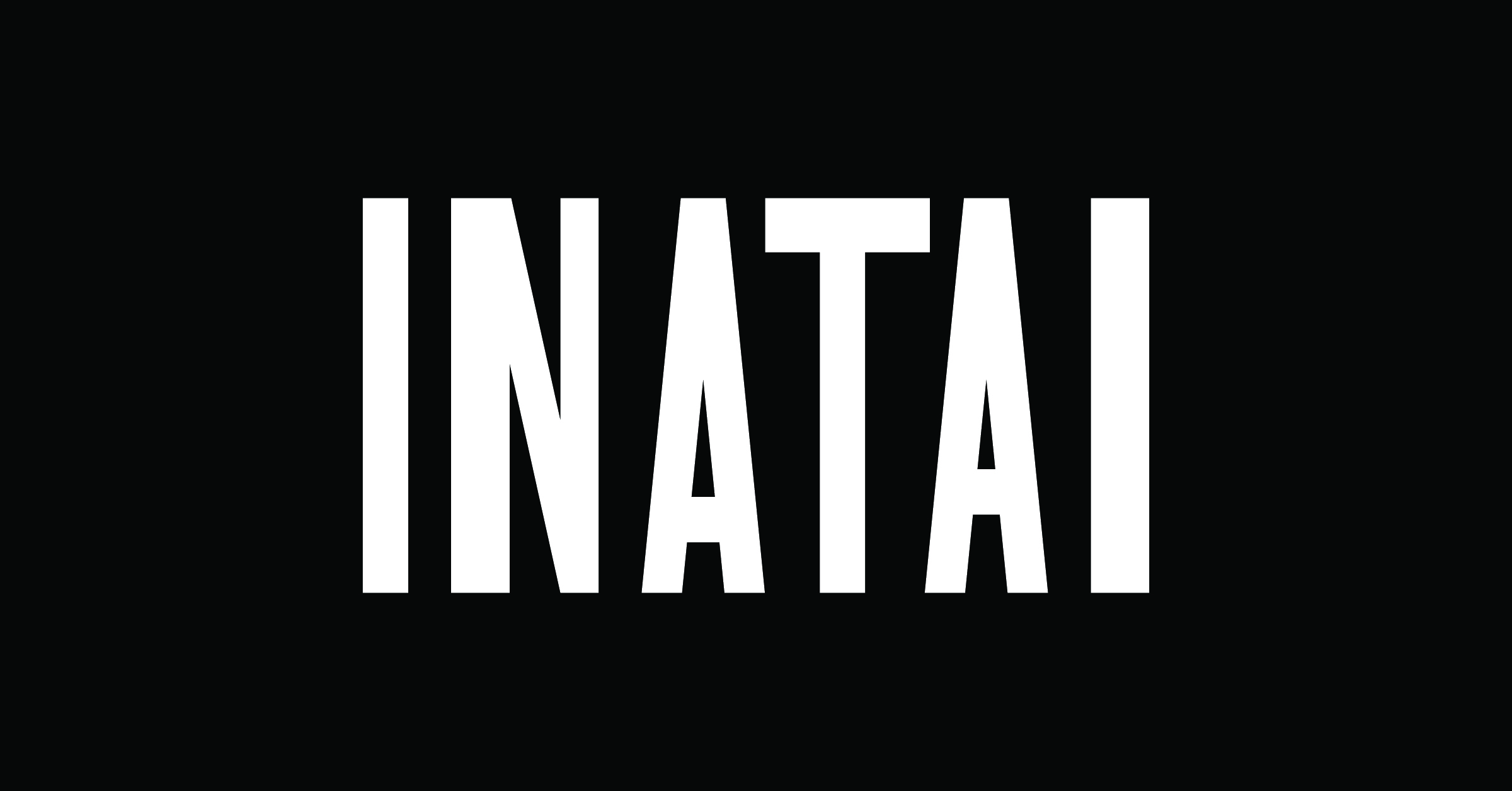
Inatai Foundation’s new typeface logo
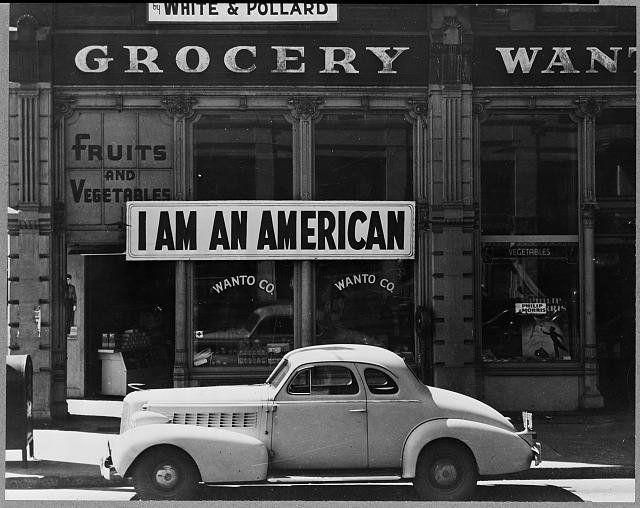
An “I am an American” banner hung outside a Japanese American business owner’s store the day after Pearl Harbor during World War II. Photo: Dorothea Lange
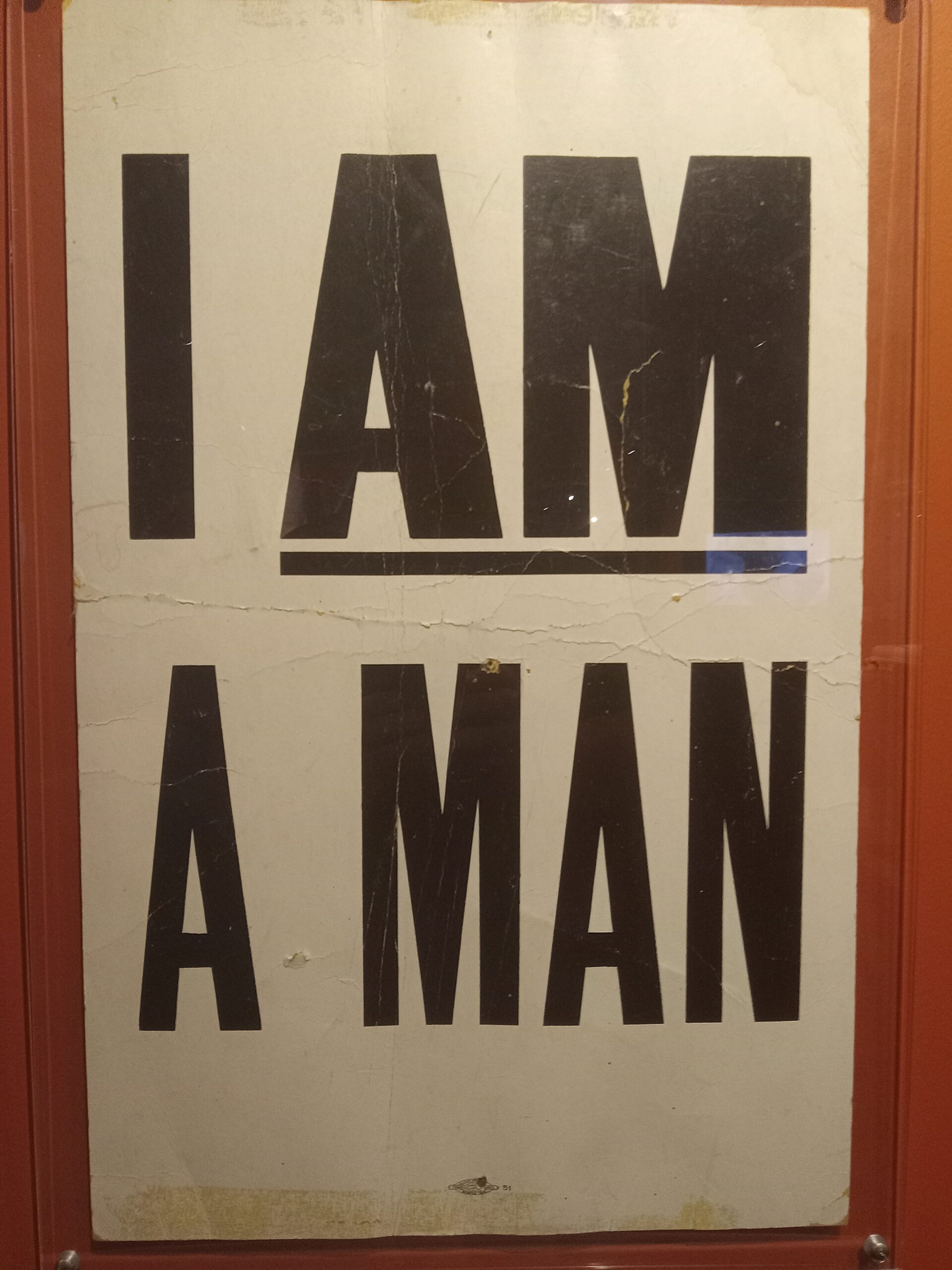
An “I am a man!” picket sign from the Memphis Sanitation Strike of 1968.
The heart of our work is people. One of our most crucial design imperatives was to create a visual system that would both call back to and carry forward the traditions of people and communities building power for racial justice and equity.
For inspiration, we looked to early expressions of community power: publications owned and operated by people of color. We explored the printing conventions these publications embraced and innovated, including their use of bold lettering. We were also inspired by the fonts that organizers, activists, and advocates of the past chose for protest and picket signs.
The work of a more racially just, equitable world remains urgent. Through our typeface logo and font choices, we wanted to dedicate our new visual brand to the people who are continuing these legacies today.
Our new colors: honoring the cultural traditions of Washington’s communities
Our new brand colors represent the natural hues and materials of the state. More importantly, these colors are rooted in how Washington’s many communities use them to make art that reflects their cultures, their stories, and their joy.

Black, white, and gray: These simple, understated colors allow the photos of Washington state’s people and places, in all their richness and vibrancy, to be the central focus of the website and brand materials.

Silver and gold: These precious metals are common materials used in Washington’s many communities, whose cultures span the world, from here in the Americas to Asia and Africa. Our brand uses shades of silver and gold as accents for luster and brightness.

Washington jade: Washington jade is found in riverbeds throughout the Cascades and in other waterways along the Puget Sound. The deep green stone is used to make jewelry and small carvings. We also selected jade for its importance in other cultural traditions beyond the Pacific Northwest.

Green copper: This light bluish-green shade is commonly seen in Indigenous artwork alongside black and red ochre pigments. Pieces passed down and preserved for hundreds of years reflect this traditional color combination.

Vivianite: Derived from an iron mineral, vivianite is a rich blue color used by Indigenous cultures across the Pacific Northwest to create art and decorate objects of religious or cultural significance.
Our future vision
In one sense, our new visual identity marks the end of a profound period of growth for us as a foundation. In another, it is the very first step toward a bright future.
The time it takes to effectively strategize and organize for transformative change is measured in decades, not months or even years. That’s why we recently adopted our 50-Year Vision: to clarify who we serve, what roles we can best play as a foundation, and the future we plan to build alongside communities. All the changes over the last year and a half express our abiding belief that powerful communities are working together to move all of us to a place of greater equity and racial justice.
We know that actions, more than anything, matters most to our brand. That’s why one thing will never change: our funding, advocacy, and other efforts will always be directed to organizations led by and for people closest to the issues—and therefore the solutions—in all 39 Washington counties. We stand with them now and for generations to come, because if inequity and injustice can transcend county lines, we know equity, justice, and joy can too.
Our team would like to thank our branding partners, DH (Desautel Hege), for their partnership in developing our new visual brand.

